

OUR BRAND
Logo & Logo Brand
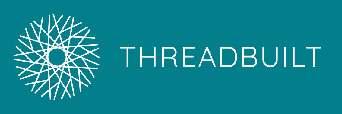
The Threadbuilt Logo Brand consists of two primary elements; the logomark and the logotype. The logomark can be used exclusively from the logotype but the logotype must always be used in conjunction with the logomark and the pipe separator – this is known as the “Logo Brand” but may be referred to as the “Logo” or “Brand”.
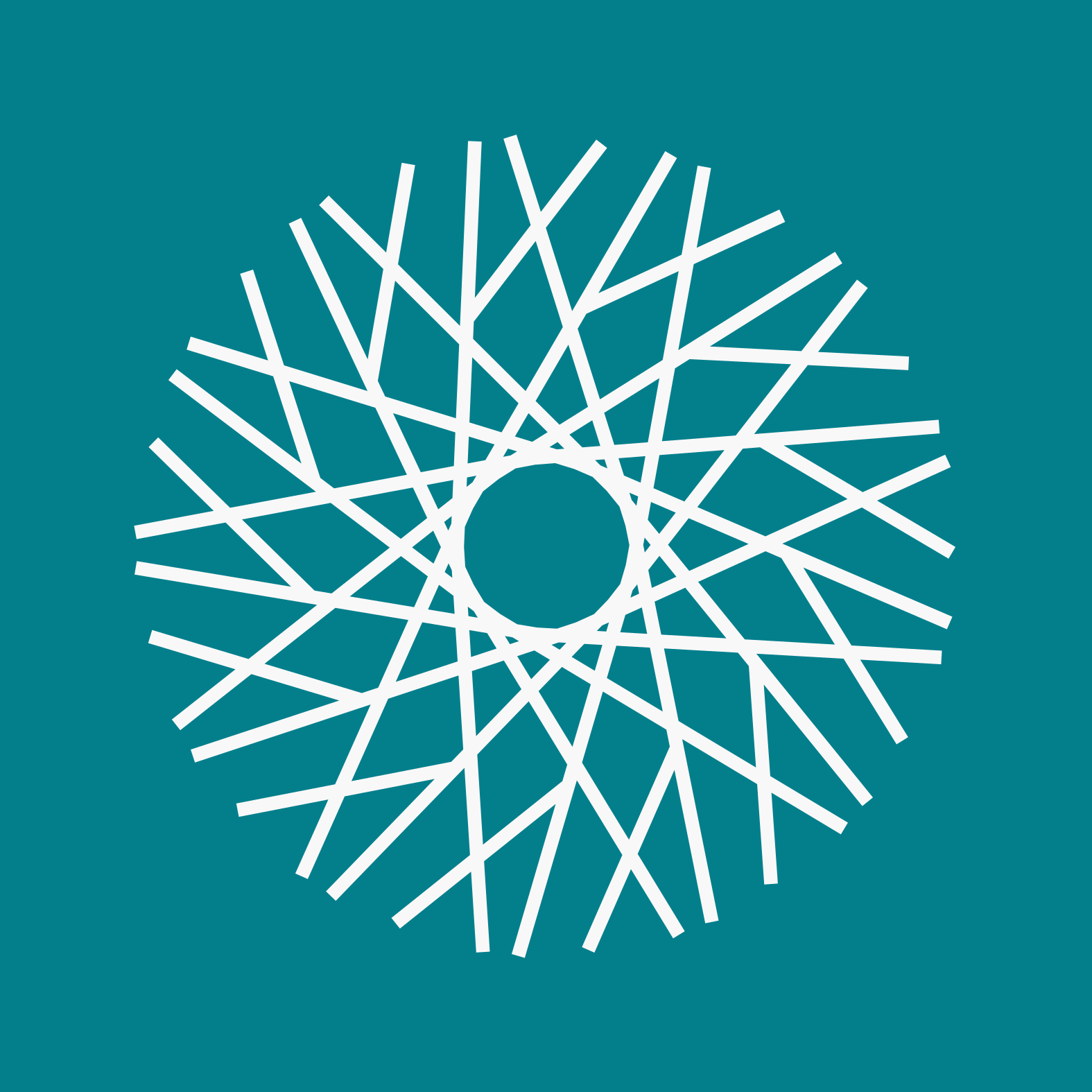
The logomark features an circular form intersected by overlapping ripples representing the orbits and paths of atoms or celestial bodies.
Types & Use Cases:
Emboss – standard logo used for all branding and imagery
Deboss – used for manufacturing where space or size constraints dictate it. This style saves on material use and often results in a cleaner easier to read finish

Logomark
Logo Brand (combination logomark & logotype)
Minimum Size:
The minimum sizes specified include the exclusion zones to maintain appropriate proportions and clearance/interference with other assets or text.
Logomark minimum size:
Digital: 150 x 150px
Physical: 30mm x 30mm
Logo Brand minimum size:
Digital: 150 x 450px
Physical: 30mm x 100mm
Font:
72pt in Quicksand
Spacing:
The height of the logomark dictates the amount of clear space from other assets or text is required - one third (1/3) the logomark height all around i.e. at 90px clearance would be 30px.
Note that this minimum clearance is to be maintained for the Logo Brand as well.
Logomark - has a minimum exclusion zone of 30px around it on all sides
Logo Brand – all elements have 35px spacings horizontally (incl. between elements) and are vertically centred along the midline thereby preserving the 30px vertical spacing for the logomark – this gives a thinner/stretched aesthetic than if 30px alone were used
Colours:
The standard logo & logo-brand utilsie the corporate branding in terms of the colour range. Several variations have been created for specific functions or use as detailed below.
Standard
Set 1 – Desert Storm on Ocean background
Set 2 – Ocean on transparent background


Note: the “white” space or exclusion zones can be omitted for use in digital forms where scaling and resolution require it, this also typically determines that the borders or positioning within that layout are not as important i.e. the logo is fixed in space and has sufficient room cleared around it
The logo is clean and subtle, featuring a simple “thread” like pattern in a circular array and branding in a simple yet modern typeface. The Logo is analogous to the modern digital workplace, specifically with the recent advent of end to end digital workflows i.e. design, manufacturing & distribution methodologies (such as on demand additive manufacturing). It also serves to signify the many overlapping threads (or connections) between previously distinct services resulting in whole new industries and opportunities that are emerging in part due to the shift in digital techniques but also due to the democratisation of knowledge and services previously considered out of reach or specialist in nature.
Don’ts:
Do not print the logo or logo-brand in plain black – dark grey should be used instead
Don’t orient the logo-brand vertically or
Do not rotate the logo – there is a right side up as indicated in the logo’s & branding shown above
TYPE
Brand & Headlines
Quicksand typeface in 72pt font for the Brand. The use of Quicksand gives a clean rounded aesthetic with a slightly playful sensibility. Use for Logos is always Uppercase but where used in print form is to be Proper Case. – all lower case or CamelCase is not to be used.
Body Text
Poppins
COLOUR PALETTE
EB9486
(Coral Pink)
272838
(Raisin Black)
F9F8F8
(Desert Storm)
Check out our Colour Palette on Coolors at: https://coolors.co/272838-037f8c-97d8c4-eb9486-f9f8f8
Coolors is a fantastic tool for generating colour palettes and is feature rich!
037F8C
(Teal)
97D8C4
(Tiffany Blue)